
Case Study: Making a Portfolio Website
/Hey all! After a long journey with numerous iterations, my website has finally reached maturity—for now, that is. To begin, I’ll tackle some key details and design decisions. Following that, I’ll provide a page-by-page breakdown of my content and thought processes.
Without further ado, let’s jump right in:
The Philosophy
Overall, my goal was to craft a web presence that’s approachable—keeping things professional yet fun, while exuding creativity. If a website isn’t pleasing to eye, visitors won’t be compelled to either stay or engage with its content.
On the opposite side of that coin, a great website must also be functional. It’s not enough to be visually appealing. The overall flow of content must be logical and visitors must have a clear understanding of navigation. The big kicker? Everything absolutely must look great—and function well—on both desktop and mobile devices.
The devil truly is in the details, and it’s always been my goal to design with solid fundamentals in mind. Accordingly, CSS styles are defined in order of render, meaning CSS rules affecting below-the-fold content will not be parsed before those above the fold. This is also done on a line-by-line level, in respect to each element’s position on the page. When working within a template, this is especially important.
Creating a Consistent Design Language
In earlier website versions, elements were defined by straight lines. Now, these same elements have rounded corners. Identical rounding is specified site wide to ensure a consistent and coherent appearance:

Make these same elements severely rounded, and they appear a bit too playful. Make them squared off, and they appear overly rigid. This offers a nice compromise. This radius is applied to all top-level images, some content sections, and navigation buttons.
Note that rounding on buttons is more severe to emulate the shape of a fingertip, making mobile browsing friendlier. Mobile UI/UX often make use of these rounded buttons (e.g. Spotify, Apple, etc.), so these navigation elements should feel familiar. That’s one easy win for user engagement.

In addition, circular edges draw attention to the buttons’ center where key text is located.
Beautiful Typography is Key
It’s the age-old debate: serif vs. sans serif. I’ve always preferred sans serif fonts for their clean look and legibility, and use them here. All headings are Montserrat and are paired with Open Sans, the body font:


Throughout the entirety of the site, I only load these two fonts. This cuts down on load time and boosts performance. These fonts are popular, so visitors’ browsers have likely cached them already.
A unified font size for body text ensures wonderful readability on mobile and desktop screens. Headings and subheadings scale accordingly for hierarchy, making it easy to determine where content sections begin and end. Reading can be frustrating when letter spacing and line spacing are inconsistent. Every paragraph and heading is identically structured, from one page to the next.
Simple Color Schemes
I try to use only a handful of colors as part of my color scheme. However, many of these will be varying shades of one another, which creates a look that gels well together. Different UI elements are different shades when appropriate for visual clarity. This also gives page elements their own identity, avoiding confusion:

Blues and grays are key site wide, and play nicely together. The main background color of the site is white. In keeping with Web Content Accessibility Guidelines, pure-black text is not used. A slightly-lighter shade, #444, is easier on the eyes. This creates a contrast ratio of 9.74:1 for body text.
Elements such as headers, footers, links, and lines have their own colors. Yet, these colors all compliment one another across the overall design.
Quick Notes on Spacing
Since web development is now embracing a mobile-first approach, I’ve taken steps to avoid some common spacing pitfalls. These issues often revolve around vertical spacing, in particular. Say we have a group of two icons, each with its own caption underneath. Now envision these vertically stacked, like in a typical mobile layout.

Ideally, you’ll want the spacing (margin or padding) between icon and caption to be noticeably smaller than the spacing between that same caption and the next icon. Since we treat each icon and its caption as a grouping, they should appear more closely associated. Care is taken to ensure these rules are followed, especially on mobile. This is especially true on the Home page, which has three SVG icons.
The “Home” Page
The first impression, the gateway to the website, and often the most impactful page of all. The flagship page of the website needs to be compelling without being overwhelming. I had some key goals for the Home page:
Keep the information and text succinct but beneficial to the visitor
Provide ample links and incentives to jump to other key pages
Keep the layout clean and relatively simple
Have a little fun and utilize some creative muscle
The copy is succinct and quickly describes what I do to visitors. Captions under the SVG icons briefly describe my key pages. In having some fun, I added in those icons to provide some modern flair to the page:

The home page also contains the largest banner image on the site, for aesthetic purposes.
The “About Me” Page
This page is pretty straightforward. It describes my background, philosophy, and contains a slider with testimonials from past clients.
The column width is restricted to emulate more prominent news or blogging sites. Previous iterations were full width, which made the content daunting to read. With a restricted line length and a tighter text container, visitors are expected to read more easily.
The “Resume” Page
The Resume page is largely the same in practice as About Me. The page is text based, and contains key information about my education and work experience. I elected not to embed a resume PDF as that would be trickier to read on mobile, and would bring the page size up.
In all, K.I.S.S. was strictly followed here. I wanted to present this information to users in a familiar, scannable format.
The “Portfolio” Page
This was recently the target of a sweeping redesign, in accordance with the Blog page. Moving from a full-width-row list of items to a grid layout aided information density immensely. More portfolio items are onscreen than ever before, which also gives visitors more context of their place on the page:
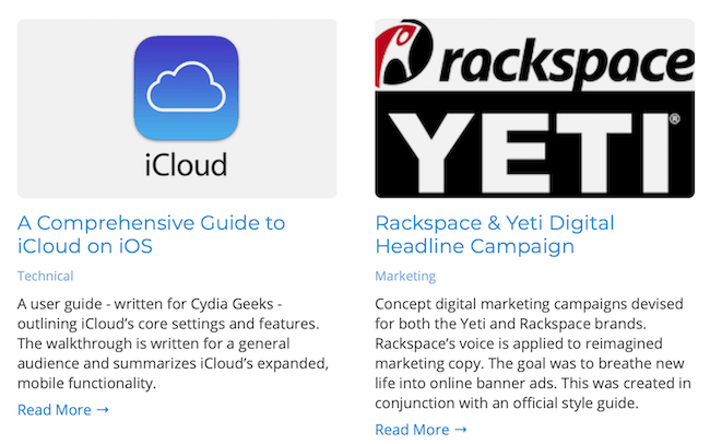
This new grid layout is three items wide and expands with ease as new items are added.
In addition, a major content overhaul was completed. Instead of hosting original PDF and Word files, each portfolio sample was manually recreated using the CMS’ rich-text editor. Instead of providing poorly-scaled documents to mobile users, writing samples now follow the same body-text sizing as the entire site. This was. an incredibly useful and exciting change.
Last But Not Least, the “Blog” Page
The Blog actually inspired the Portfolio page’s rework. I improved this page with the addition of a grid layout. With the added content density, visitors can quickly scan multiple article previews. Given that there are a large amount of items, there is less work involved to view everything the page has to offer. Quality-of-life wins for visitors are always welcomed.
Overall, it’s been a great, challenging project! I look forward to cooking up more awesome changes, and hope you enjoyed the read.